Building a Strong and Inclusive Brand Identity
Rebranding ASA
In 2020, I began working with the American Society on Aging (ASA) as they underwent a major rebranding and launched two new websites.
Background
The American Society on Aging had not refreshed its brand in decades. As they began the rebranding process, they approached me to collaborate with them on the launch of their new brand and websites. Having previously worked with ASA — it was where I got my start in nonprofit communications — I was excited to work with them on their new vision.
ASA had a history of strong diversity in its programs and content, but their new vision placed a renewed emphasis on equity. Additionally, the organization prioritized policy and advocacy on behalf of older adults and the people who work with them. To communicate these new commitments, their new brand voice needed to be strong and inclusive.
My Approach
Before my involvement, ASA had worked with a design firm to develop a new brand and branding guidelines. My role was to implement the new brand and develop the organization's new identity. To create a strong and inclusive brand voice, I prioritized diverse representation in the graphics and content. I intentionally chose images that almost anyone could relate to and see themselves in on ASA's new websites. Using ASA's new branding guidelines, I designed graphics and logos for their programs that were bold and striking and developed content that highlighted their new priorities.
Websites
ASA launched two Drupal-based websites — their main organization site and a new site for their digital publications. Using Druptal CMS, I built out the design, collaborated on the content, and consulted on necessary features for both websites, prioritizing diverse representation, accessibility, and usability to provide a better user experience for all visitors.

For the ASA's main website, I selected images that complemented the organization's new brand palette and embodied their commitment to diversity, equity, and inclusion, helping to build the organization's new voice.

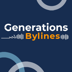 I created logos and graphics that helped establish an identity and cultivate brand recognition for ASA's programs and resources. Among other things, I designed logos for several of ASA's podcasts and took on production responsibilities for them, including selecting theme music, developing a modern style, and ensuring that they were available on ASA's site as well as on all major streaming platforms.
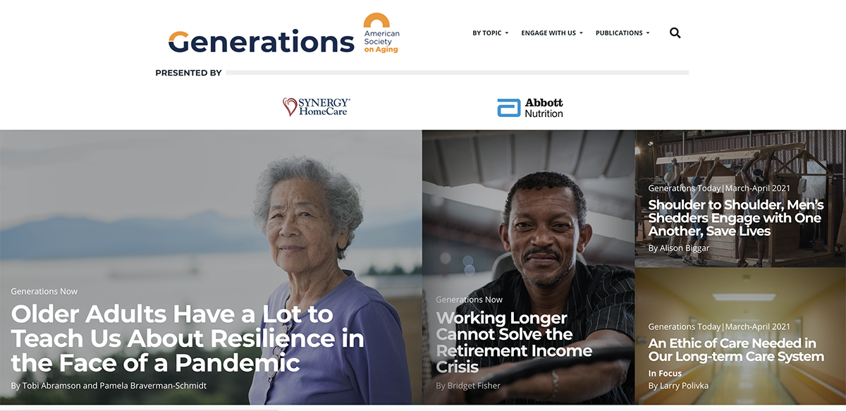
The new publications site featured an image with every story. My selection of images was driven by both the content of each individual article as well as my overall goal of having a site that everyone could see themselves in.
Event Example
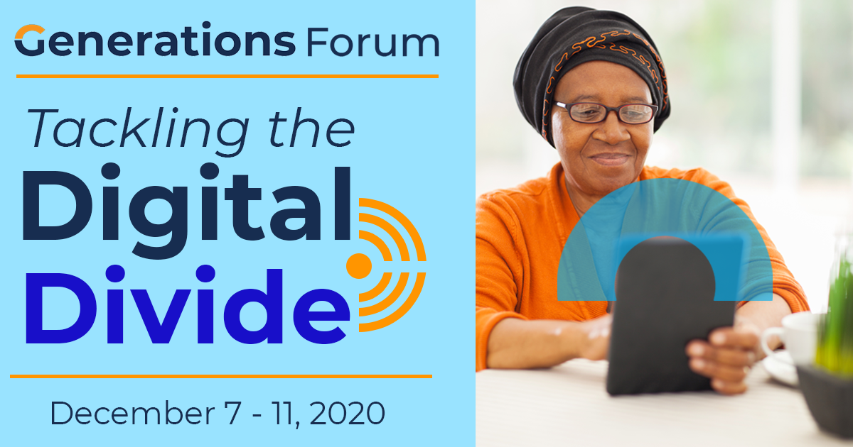
 As part of their new brand, ASA also launched new events including Generations Forums, which were virtual mini-conferences on specific topics. As the forums covered various topics and were a new event for the organization, my goal was to create a recognizable identity for each one that was both distinctive and cohesive with ASA's new branding, using the event logo and image. To ensure consistency across all event collateral, I optimized the graphics for the website, email promotions, each of the social media platforms ASA used, and digital handouts.
Social Media
My approach to social media content and graphics mirrored my approach to designing website content and event collateral. My goal was to share quality content that centered the voices and experiences of historically marginalized communities, reflecting the organization's commitment to equity.
I believe that quality and inclusive content comes from community, so I started an internal channel where staff could share news stories and other content inspirations. Additionally, I listened to the voices in the aging space that aligned with ASA's mission and priorities, particularly individuals and organizations that represented historically marginalized communities. I lifted those voices up through shares, retweets, and spotlights. For example, I initiated a weekly social media post to share other podcasts produced by organizations or individuals that featured stories at the intersection of aging and diversity.

In creating graphics, I maintained the bold design choices that typified the organization's new brand identity, strongly centering images of people and prioritizing inclusion. This was defined broadly to include race, ethnicity, sexuality, gender, disability, and age. When ASA launched a new leadership development program for professionals of color, ASA Rise, the content and collateral I created to promote the program felt right at home within the imagery we had been sharing for almost a year. We used the ASA Rise Social Media Toolkit (PDF) both internally and shared it with partners to promote the new program.
The Takeaway
Throughout ASA's rebranding project, my focus was on prioritizing diverse representation and voices, accessibility, and usability. My goal was to create quality content that centered the voices and experiences of historically marginalized communities, reflecting ASA's commitment to equity. This was achieved through various initiatives such as starting an internal channel for content inspiration, uplifting other organizations' content that featured stories at the intersection of aging and diversity, and promoting new events and programs through bold, inclusive design choices.
Overall, the ASA project serves as an excellent example of how a commitment to equity and inclusion can guide all aspects of an organization's communication and branding efforts. By prioritizing diverse representation and voices in website design, promotional collateral, and social media content, I, working with the rest of ASA team, was able to create a more inclusive and engaging platform that better reflects their mission and values.